

MONOMI
Visual identity
Stationery and
supporting collateral
Color palette
Production consulting
Stationery and
supporting collateral
Color palette
Production consulting
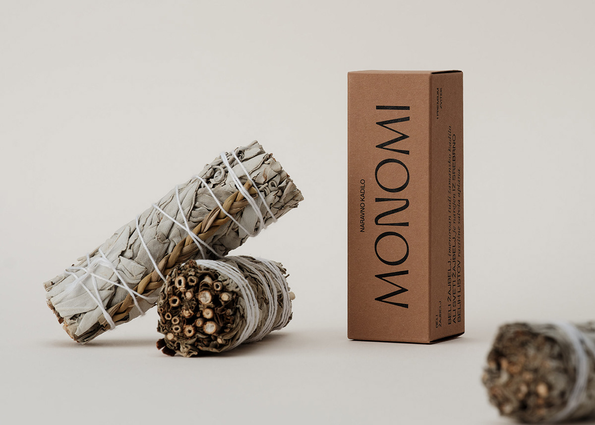
Packaging
Monomi is an online boutique brand aimed at simple urban living and yoga. The name is coined from the prefix "mono," representing the individual, and the word "mi", which encompasses the broader community. Combining these two words emphasizes the connection between the individual and society. Each of us influences our surroundings, just as our surroundings affect us.

The logo design is based on typography, with its uniqueness coming from the distinctive design of the letters. We have created a harmonious balance between elegance and organic shapes to evoke associations with spirituality or yoga. As a secondary graphic element, we have used two different fonts: a simple sans-serif and an elegant serif font. This creates a seamless flow between elegance, spirituality, and urbanity. We have applied this style to all materials, including packaging.


The brand's color palette is composed of muted shades of tobacco brown, Sahara yellow, and neutral ivory, all of which are inspired by nature. These tones blend seamlessly with the retail products, creating a harmonious customer visual experience. In addition to the retail products, the brand also offers its own line of products, and we have designed gift packaging for them.


Design: WDS — Product photography: Sami Rahim — Styling: WDS


